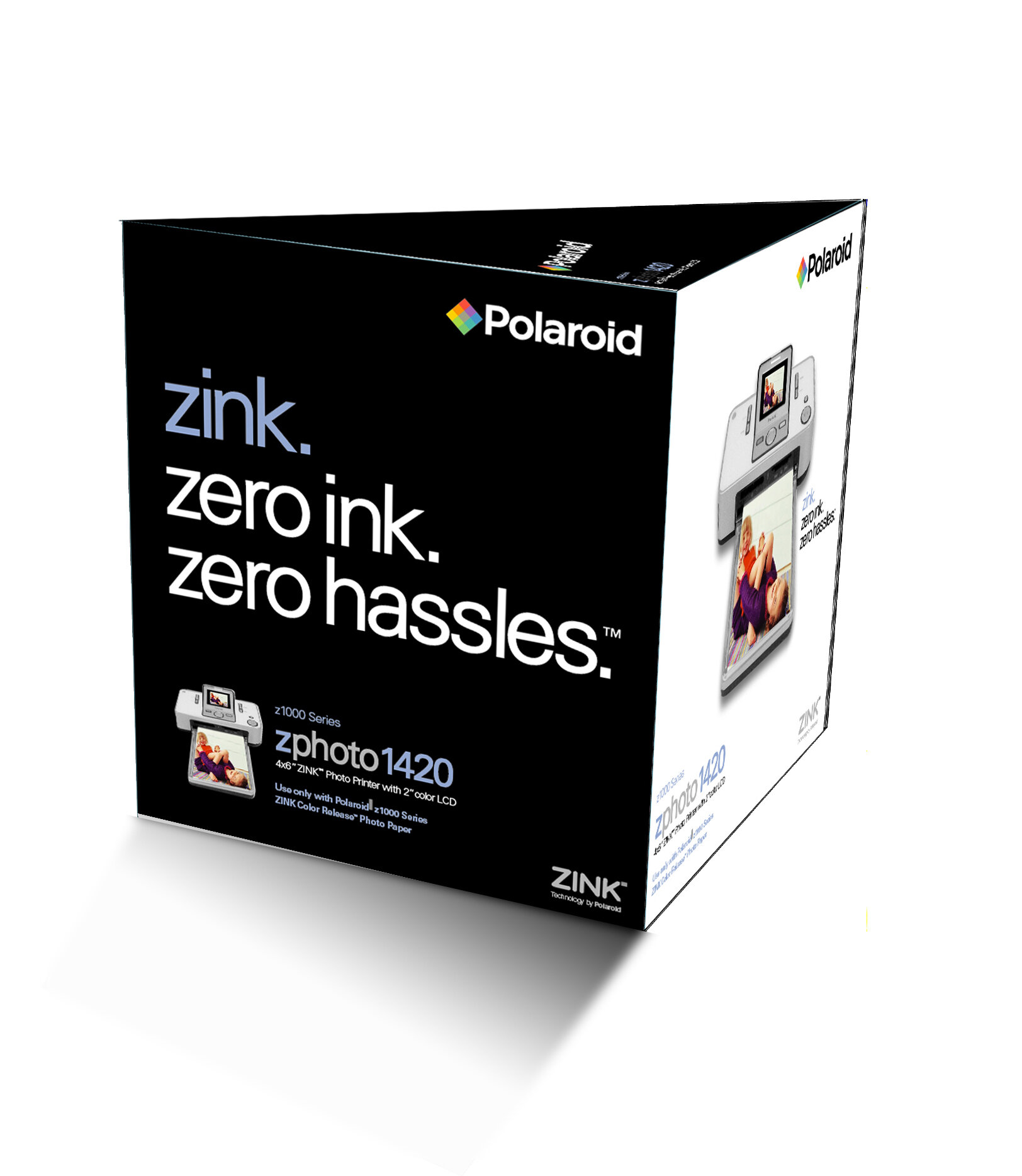
Polaroid | Zink Imaging
Zink. Zero Ink. Zero Hassles
After spending decades and billions of dollars developing a commuter bus and light rail system for the sprawling Los Angeles region, the Metro (Los Angeles Metropolitan Transportation Authority) needed to create a comprehensive identity system for citizens of Los Angeles.
Metro assembled an in-house design team to brand the system and develop signage and wayfinding guidelines, identification for rail and bus stations, fleet graphics, image advertising, website, timetables and maps, bus passes and brochures, merchandising and other materials.
Signage ranges from grand pylons identifying Metro rail stations to blades for 18,000 bus stops. New station markers are modern stainless steel wedges with push-through lettering, topped by the distinctive Metro logo. Designers maximized the signs' visibility by using innovative materials, including perforated vinyl and plexiglass panels that allow customers to see a positive (black) logo by day and a negative (white) logo by night.
Metro's bold new fleet design (which The New York Times calls “sleek-with curb [and sex] appeal”) was developed to increase visibility on the street. The system's former paint scheme was a generic white with costly custom decals, and difficult for customers to distinguish from a distance. Vibrant new colors were chosen to denote service: “California poppy” for Metro Local service, “rapid red” for Metro Rapid service, “business blue” for Metro Express commuter service, and “stylish silver” for Metro Rail and Metro Liner service.
Metro's first comprehensive Signage Standards Manual was developed to integrate both bus and rail signage and wayfinding concepts. The standards address issues including accessibility and the existing architecture of the Metro system. The standards include a plan for the re-vitalization of existing environments and address future construction and extensions of the transit system.
Other projects included station identifiers and a banner system promoting the Metro's new fast-track Orange Line. Bold, colorful banners with engaging text were installed along the new line during the months leading up to and following its opening. The banners encouraged ridership and enhanced safety awareness for vehicles not accustomed to the street-level intersections.
RESPONSIBILITIES
Brand Identity
Signage & Wayfinding
Fleet Design
Advertising
Art Direction